Commissions - Trail Blaze
I was asked to work on a painting around the theme "Trail Blaze"
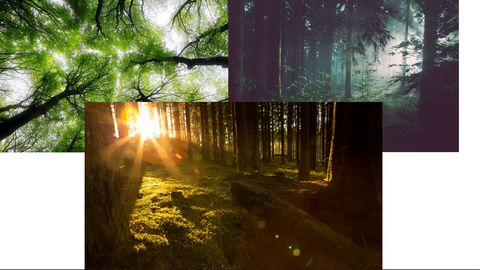
When I think about trail blaze, my brain starts imagining new adventures, courage, growth, mystery. My practice is around emotions , chromology and quite often it is inspired by natural elements, in this case the first images that appeared where forests, mountains but also lakes, the sea, unexplored territories. I will use colours that represent adventure,courage, growth and combine them with natural elements. That is why I will be predominately be using Greens and Blues.

The idea is to move and blow the paint fast which will create a sense of urgency and adventure. However, the green and blue tones will bring calm to the
piece which will balance the overall image, the gold and white will bring light to the artwork. I will be lying the paint vertically without leaving negative space but just covering the whole canvas, with upwards blows and movements. The
reason behind this choice is that I want the audience to look at all the different paths that the painting creates, look for the one they feel represents them the most, creating a moment of mindfulness where the person is not just passively looking at a picture but is involved by making the conscious choice of following or creating a new trail.
Green (secondary colour) is the colour that more than any others represent nature. According to colour symbolism and
colour psychology it is a colour that inspires growth and new starts, new beginnings. What is trail blazing if not a new beginning? New beginnings inevitably lead to growth, development and adventures within ourselves

Blue (primary colour) holds many meanings in chromology. In this painting I will use it to bring a sense of tranquility, calm and mystery. However, blue is associated with stability and reliability which I think is fundamental when thinking who you want to associate with and who you want to follow. Like the sea and the sky, blue offers a moment of reflection and studies reveal that using blue in office spaces increases productivity.

Besides being my signature colour as it’s reminder of my Colombian roots , gold will bring light to the painting forming paths that recall trails.

Orange will create contrast with cold colours. Orange in colour psychology represents adventure, creativity and courage, it stimulates positive feelings which help enhancing communication and social life. It is known for being a colour that inspires to push personal limits and look for new ideas and possibilities

And here is the finished artwork


